Friday 30 September 2016

Photography Plan

OPTION 1
Where: LRC or Outside front of school
Wearing: School uniform
Doing: Thumbs up
Camera shot: Medium Close Up

OPTION 2
Where: LRC
Wearing: Student in school uniform
Doing: Reading revision guide
Camera shot: Medium Close Up

E.g. Similar to below (previously analysed) but with revision guide and Plantsbrook uniform.

School Moodboard


Conventions of a magazine front cover and contents page

Front Cover


  • A masthead for the school magazine.
  • A headline, which is about the main feature in the magazine.
  • A strapline, talking about the headline's article.
  • Coverlines, which give the audience an idea of what is in this issue.
  • Pug/Starbust, something that stands out to the audience so that they are more likely to read it.
  • A main image. Usually about the article the headline talks about.
  • Date if issue.
  • A variety of font sizes (masthead will have large font, headline large font, streamline and cover line smaller).
  • Price.
Contents Page
  •  Some images about the articles in the magazine.
  • A table of contents, which includes captions giving the audience and idea about what the article is about.
  • Page numbers and information as to what articles are on the page.
  • Captions for the images on the contents page.
  • Columns

Contents of a School Magazine

The school magazine is likely to include things such as:

  • Interviews with teachers/staff.
  • Letter from headteacher/deputy/assistant.
  • School sports team fixtures.
  • Help/guides for revision and exams.
  • School events.
  • Information on the new build.

Target Audience for School Magazine

The target audience for a school magazine would be students at the school, parents/carers, and staff at the school. The target audience would be aged between 11-18 (students) and 25-65 (staff and parents/carers). This means that the magazine has to cater to a wide audience. These people are likely to be interested in the school and be in the local community.

More Masthead Ideas

Chosen due to being modern, which when the school gets the new building, it will be,

This is fitting as it is a school and therefore a handwritten font represents writing in a exercise book.


Analysis of a School Magazine Contents Page

Sunday 25 September 2016

Analysis of existing school magazines

Scribe

Analysis of Existing School Magazines NEW

Onedrive version (older)

Thursday 22 September 2016

Possible names for my school magazine

After thinking, I have come up with some names that could be used for my school magazine.


  1. PB Mag
  2. Plantsbrook Monthly
  3. Plantsbrook Mag
  4. PB Student
  5. PbM 
  6. PB Monthly
  7. YourPB
  8. The Brook Mag
  9. Plbr 
  10. Plantsbrook Magazine

Thursday 15 September 2016

Masthead research and analysis


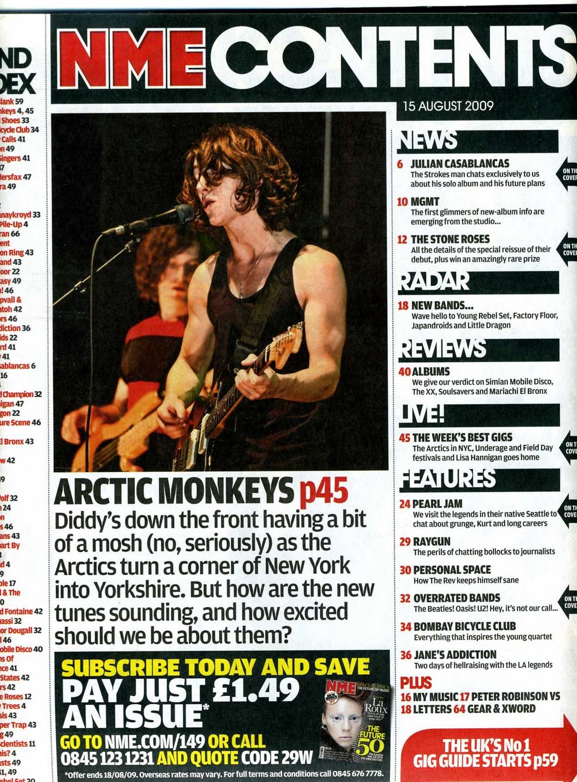
This is the masthead for NME. It uses a bold, sans-serif font which is modern and informal. The colours are contrasting and eye catching, with red, white and black being a large contrast from each other. There is also a drop shadow separating the white and the red. This makes it stand out to the audience when they see the magazine. It acts as a logo and is placed at the top of the magazine. It is largely associated with rock, alternative and indie music. So that will be their audience.


The Kerrang! masthead uses a sans-serif font. it is bold and is mostly a white colour, however it is not a uniform fill as it has the black lines going through it making it a pattern fill. It acts as a logo and is placed at the top of the magazine. The magazine itself is aimed at rock music fans.

The Q masthead is very simple. It's a white Q on a red background. On the lower right of the Q, there is a drop shadow that can be seen on the red background. In addition, the font is serif. The magazine is the UKs biggest music magazine, featuring the most important bands.


The Rolling Stone masthead uses a serif font, is red with a white to make it stand out and then is 3D with the other sides being black with white stripes. It has been published since 1967 and the font seems quite fitting for the age.

This masthead uses a modern, sans-serif font. Again, quite fitting due to it being from the 1990s. The main font is black, with red text over the top saying 'The Music Magazine' in a handwritten style. The magazine is focused classic rock, which actually makes it stand out quite a lot as the more modern font is less kind of expected for classic rock, however more modern bands do also appear.